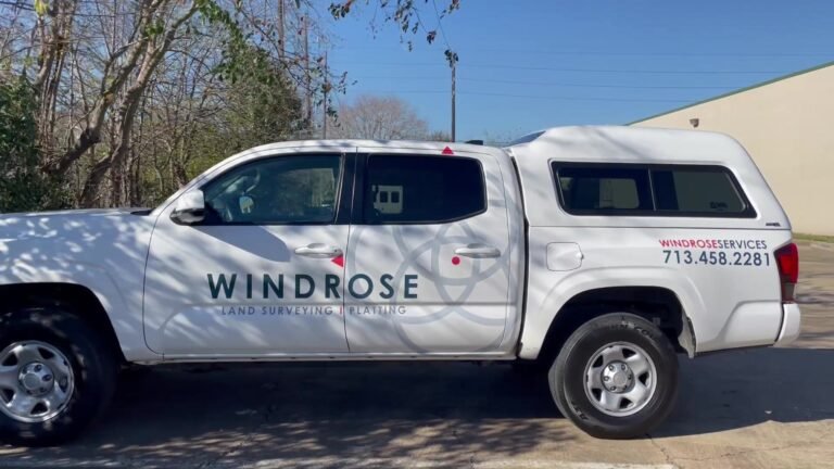

A logo is the most recognizable piece of a brand, but it is not the whole brand. Your brand identity is the system of decisions — color, typography, layout, imagery, and voice — that makes your business feel like itself everywhere it appears.
When that system is consistent, a customer who sees your storefront, receives your business card, and spots your wrapped van on the highway experiences one coherent business, not three unrelated impressions.
Start with the decisions that repeat
A practical brand identity answers a few questions once, so they never have to be answered again: which colors represent the business, which typefaces carry the voice, how the logo sits in different contexts, and what photographic or illustrative style feels on-brand.
Captured in a simple guidelines document, those decisions keep everyone — designers, printers, sign makers, and web builders — pulling in the same direction.
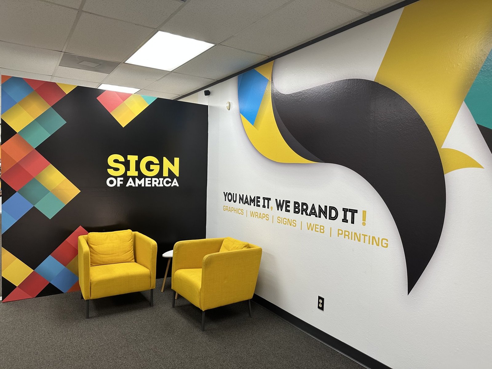
Design for every surface
A logo that looks perfect on a website header may struggle on a vehicle door or a small business card. A strong identity is built to scale: it holds up at three inches and at thirty feet, in one color and in full color, on a dark background and a light one.
We prepare artwork that is production-ready across formats, including vectorization of suitable existing artwork so it reproduces cleanly at larger sizes.
Refresh, do not always restart
Not every brand needs to start from scratch. Sometimes a careful refinement — a cleaner logo lockup, a refreshed palette, a more consistent type system — carries an established business forward without throwing away the equity it has built.
Whether you are launching a new venture or refining an existing identity, we connect the visual details and prepare the artwork your business needs to look consistent everywhere.
Related: Branding & design · Logo design · Fleet graphics